The latest sermon series at our church is titled "Vision Mission Values." Here's a short tutorial on how I made a sermon series graphic for it.
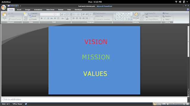
1. This is what I started with:
 The first thing I did was to align the three text boxes containing the words. Here's a good tutorial on alignment, complete with a video: http://www.gcflearnfree.org/powerpoint2013/19.
2. Since the title is rather abstract, I chose to create a graphic in the popular new style of textual art (or chalkboard art). The first thing I needed to address was the font. The font used above is Tahoma, a rather nice font in itself. However, it is very worn out in connotation. It was one of the better fonts widely distributed in Microsoft Office during the late 1990s, and as such it became very overused. This makes it less than eye-catching these days.
Another problem with the font is that it is a partial serif (as identified by the cross-bars on the capital "i"s above). Serifs as a group are suffering an unfortunate loss of favor in this decade. Sans serifs are more popular right now because of their look of simplicity. (Even Google recently changed their logo from a serif to a sans serif font.) Whether or not this is fair to serifs is a topic for another forum.
I changed the font to PT Sans, a more modern-looking font available from Google Fonts. It is also tighter in spacing and smoother, setting off the text nicely.
3. The font colors also needed tuning. The red, green, and yellow were too saturated to pop out against the bright blue background, making the text easy to miss and, in the case of the red, difficult to read. (Saturation can be thought of as the opposite of grayness. The colors on a gray, rainy day have low saturation because they are quite gray.) I chose more muted pastels from the built-in Office palette instead.
The colors are now more aesthetically pleasing, but only a little easier to read. I saved further tuning for later.
4. The text is aligned now, but lacks any idea of unity or cohesion. There doesn't seem to be much purpose for the collection. There's a lot of blue space, making the words seem lost on the page. I decided a decorative border could help out by creating a clear line between the words and the rest of the space.
Unfortunately, PowerPoint doesn't provide many nice built-in frames, but I didn't have any time to look for some online. I chose a 24-pointed star by going to Insert > Shapes > Stars and Banners and clicking and dragging. I chose the star to give the graphic a "tribal" feel through the use of a zigzagged line.
I used the little yellow diamond to make the points much less pointy. I centered this star on the slide and moved it to the back.
To play up the tribal feel, I went to Format > Shape Outline > Weight > More Lines and chose a double line of 8 pt, which I made white to distinguish it from the background of the shape.
Now the text is set off nicely from the background in an obvious grouping. In fact, the new grouping makes the spacing between words seem too extreme, because it's now obvious the words belong in the circle. I brought the words in closer to each other. (For best control, click on the words and use the up and down arrow keys to move the words one fine step at a time.)
I also darkened the background of the shape to bring more contrast with the words and the shape and the shape and the background. Now the words really pop:
5. This is good but not great. It's still kind of flat-looking. It needs a slight touch of frilly texture. I used a sky picture I had previously found on New Old Stock and saved on the computer for an opportune time. The pictures on New Old Stock are vintage and have no known legal restrictions. To keep with the overall color scheme, the picture was sky blue, of course.
I made this picture the background of the slide by going to Design > Background Styles > Format Background and clicking "Picture or texture fill". I then selected File and located the image on my computer. (If it had been the wrong color, I could have used the transparency slider to make it partly transparent and let the blue color of the background bleed through.)
6. I wanted the clouds to show through my circular border to give it some texture, too. I clicked on the object and went to Format > Shape Fill > More Fill Colors. I adjusted the transparency slider to 30% and clicked Ok.
There! I hoped you enjoyed this tutorial.


No comments:
Post a Comment